Chicago Communities Socioeconomic Profiles

This data visualization shows each neighborhood in Chicago and a profile of their socioeconomic factors. These factors include:

Data is from the City of Chicago.

Hardship Index and Per Capita Income

These two data visualizations show communities with a Hardship Index under 20 (top graph) and communities with a Hardship Index above 78 (bottom graph) alongside their per capita income. Data is from the City of Chicago.

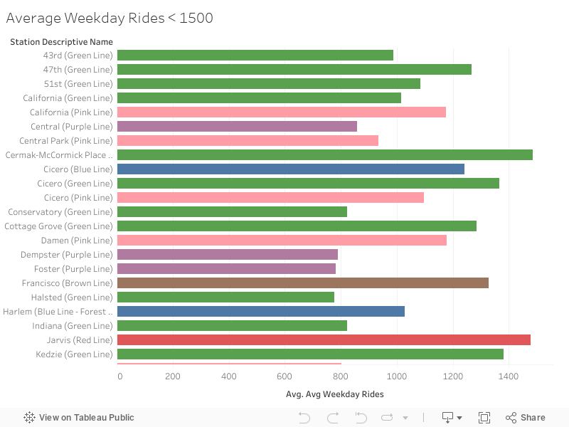
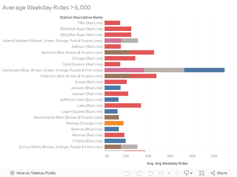
CTA 'L' Ridership by Station

Combining data from the CTA's List of 'L' Stops and 'L' Station Monthly Averages and Totals datasets, we can see which stations (and therefore, which neighborhoods) have the highest and lowest 'L' train ridership.

The top visualization shows stations with less than 1,500 weekday trips. The bottom visualization depicts stations with greater than 6,000 weekday trips. Express Purple Line stops were excluded for simplicity. Grey bars denote multiple line colors per station.

All data were obtained from the City of Chicago.

Hardship Index and 'L' Lines

This map uses City of Chicago neighborhood geospatial data and 'L' station geospatial data with the socioeconomic data from above.

The map is sectioned into different neighborhoods that are color-coded by Hardship Index (neighborhood name and hardhip index are shown on hover). The 'L' lines are overlayed to illustrate different communities' access to the transit lines.

Quality of Life (Hardship Index) and Access to Transit

To understand the relationship between access to transit and quality of life, we used Hardship Index as a measure of quality of life and Transit Score from Walk Score as a measure of access to transit. Walk Score calculates a Transit Score using data about each neighborhood. You can find more about this process here. Transit Score ranges from 0 to 100 with 100 being great access to transit and 0 being no access to transit. A higher Hardship Index means a lower quality of life.

All Socioeconomic Factors Assessing Quality of Life and Access to Transit

Since looking at just the relationship between Hardship Index and Transit Score appeared to be insufficient, we attempted to better understand whether or not there's a connection between quality of life and access to transit by examining the various socioeconomic factors that are used to compute the Hardship Index. All scatter plots are created using the same Transit Score described previously. Hardship Index vs Transit Score is still presented first, for comparison.